Remote, the global employment platform known for its Employer of Record (EOR), payroll and contractor management services, has launched a new brand identity organized around a three-word mission: “pay the world.” The refresh covers its logo, typeface, colors and imagery.
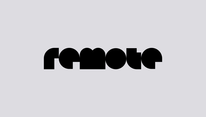
Remote, the global employment platform known for its Employer of Record (EOR), payroll and contractor management services, has launched a new brand identity organized around a three-word mission: “pay the world.” The refresh covers its logo, typeface, colors and imagery.
The bigger story is the positioning behind it.
In its announcement, Remote describes itself less as an employment platform and more as payroll infrastructure: a financial operating system for the global workforce. The company says the underlying products customers use today are unchanged.
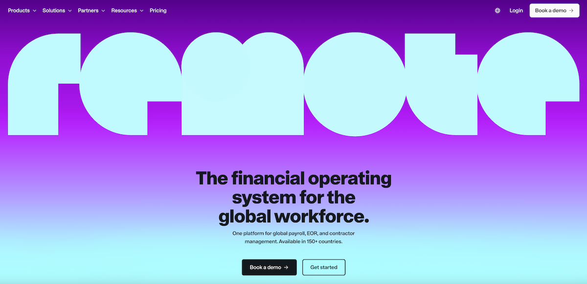
Remote says its new bet is on infrastructure. The company states three goals: to be the authoritative system of record for people data, to run payroll globally, and to make that foundation accessible to AI agents, third-party tools and custom apps.
This builds on an earlier message. A few months before the rebrand, Remote said it was going “all in” on hard problems, singling out compliant hiring and payment as non-negotiable for global businesses. The new identity is meant to reflect that focus.
The emphasis on APIs and AI agents places Remote alongside a broader industry trend. Several EOR and global payroll providers are now pitching themselves as platforms that other software plugs into, rather than standalone services.
Remote updated its logo, wordmark, typeface, color palette, photography and illustrations, and gave its platform a new look and feel. The main elements include:
For existing customers, little should change day to day. Remote says its global payroll, EOR and contractor management services remain the same beneath the new design.
For companies comparing providers, the rebrand is mainly a signal of direction. Remote is putting payroll accuracy, time tracking and integrations at the center of its pitch. That may appeal most to businesses that:
Businesses with simpler needs, such as hiring a handful of people in one or two countries, may find the infrastructure focus less relevant than price, local support and onboarding speed.
Remote’s new identity is a clear statement that the company wants to be known first for global payroll infrastructure, not only as an EOR. The visual changes are substantial, while the services customers rely on stay the same. Learn more on their website here.